House Sale Price Data Analysis and Prediction

Technical walk-through on house sale price prediction using CRISP-DM with modelling done using XGBoost, KNN, Linear Regression, Ridge Regression and Cat Boost.
Summary
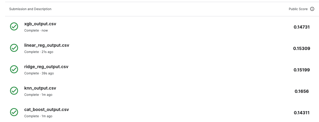
For this house sale price prediction challenge CatBoost showed the best accuracy followed by XGBoost against the base linear regression model see figures 33, 34, 35 and 36.
NOTE: In the real world, you would account for model drift and how you would retrain your model(s) as the accuracy drops.
Business Understanding
Ask a home buyer to describe their dream house, and they probably won’t begin with the height of the basement ceiling or the proximity to an east-west railroad. With 79 explanatory variables describing (almost) every aspect of residential homes in Ames, Iowa. We are going to predict the sales price for each house. For each Id in the test set, we must predict the value of the SalePrice variable.
Data Understanding
Here we will look at the data and hopefully find interesting patterns and relationships in the data. There are a few assumptions that we will make and we will explore the data to see if these assumptions are true.
Usually when shopping for a house people might consider the following items:
- Construction date
- House area
- Neighbourhood
- Number and size of rooms
- Parking area
We will try and see if the above items correlate strongly to the sale price.
The train data contains 1460 observations and 81 features and has data types of int64, Objects and float64; there are 43 categorial features and 38 numerical features.
There are a total of 7829 nulls, the categorical columns have 7481/7829 which is 95.56% as shown in Figure 2. Numerical features have 348/7829 nulls which contributes 4.46% to the total number of nulls as shown in Figure 1.
Numerical columns

Categorical columns

Data Preparation
We are going to drop the categorical columns PoolQC, MiscFeature, Alley, Fence, MasVnrType and FireplaceQu which contribute 89% to the 7481 null values as shown in Figure 2. Figure 1 shows we do not need to drop any numerical columns because the percentage of nulls for numerical columns is below the 20% threshold marked with the red dotted line.
Correlation of numerical values
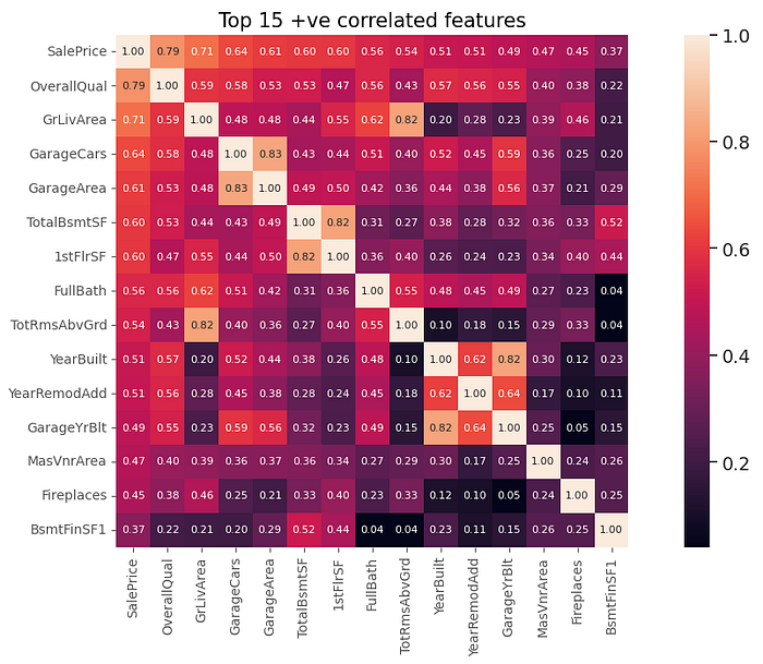
Figure 3 shows a heatmap created from the correlation matrix; we can see that the OverallQual feature has the highest positive correlation of 0.79 which makes sense a home buyer would look at the quality of the house before purchase. The GrLivArea has a correlation of 0.71; a buyer would look at how much space the house has. The GarageCars has a correlation of 0.65, — I mean who would not want parking? The GarageArea has a correlation of 0.61 which is similar to GarageCars. The r value for GarageCars and GarageArea is 0.83 which shows there is multicollinearity between the columns — which is not desirable in some machine learning algorithms so we are going to drop GarageArea and other features that have high multicollinearity. The columns that were dropped were GarageArea, 1stFlrSF, GarageYrBlt and TotRmsAbvGrd which were above our threshold of 0.8.
Sale Price
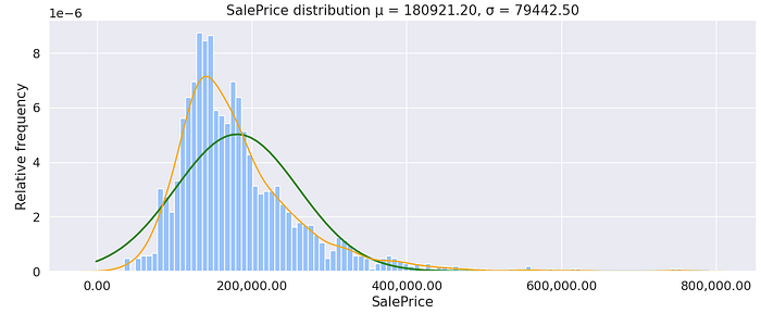
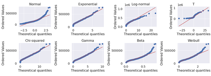
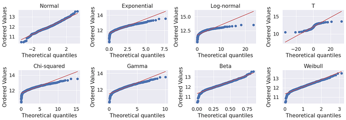
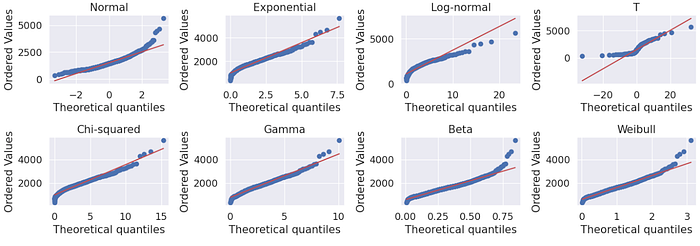
The sale price is a continuous data type that is not normally distributed; the minimum sale price is 34,900.00 and the maximum is 755,000.00; the average sale price is 163,000.00. The distribution is right skewed and looking at the probability plots (QQ plots) in Figure 5 it looks like it follows an exponential or chi-squared-like distribution. The mean sale price is 180,921.20 is larger than the median showing some houses are highly priced — could be outliers. The sale price has a standard deviation of 79,4420.50 which is significant, this could be because of the outliers. Later we will explore the data to see why that is the case; we will also see what effect the removal of the outliers has on the distribution of the data and the measures of central tendency.

Notice the sale price outliers in Figure 6 that cause the sale distribution to be right-skewed.

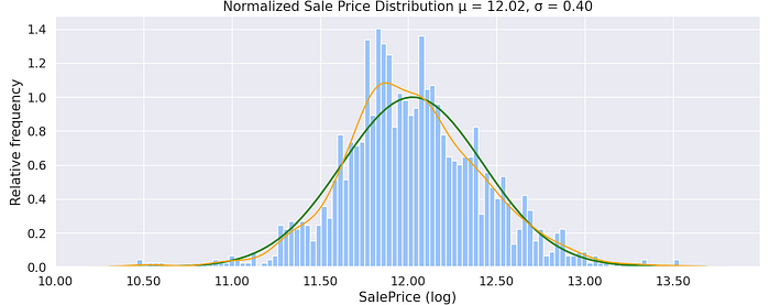
Below in Figure 7: shows the result normalization has on the target variable; it looks Gaussian-like. Figure 8 shows QQ plots after normalization — Compare the changes with Figure 5.
Overall Quality
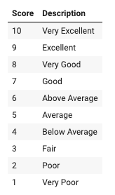
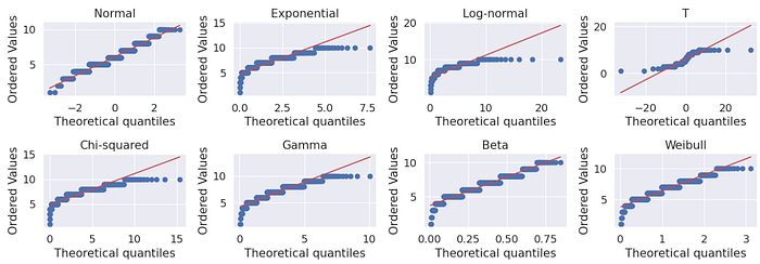
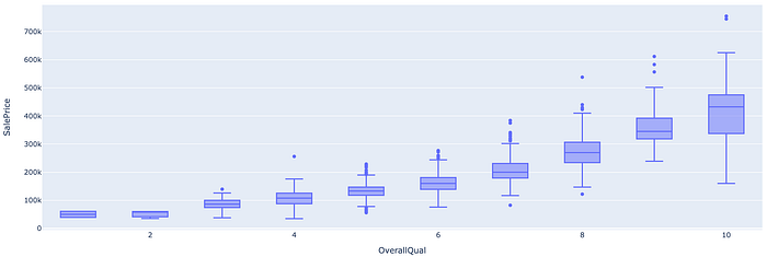
The overall quality is os ordinal and is normally distributed from the histogram in Figure 11 and QQPlots shown in Figure 12. Additionally, there is a positive correlation between the sale price and overall quality; Figure 13 shows sale price increases as the quality increases.

Above Ground Living Area
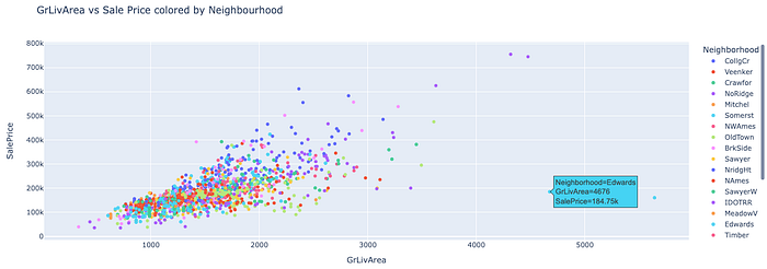
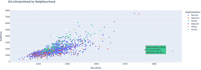
The GrLivArea is a continuous numerical variable with a chi-squared/gamma-like distribution. We can see that there is a positive correlation in Figure 3 between the GrLivArea and SalePrice with a Pearson r value of 0.71 which is expected. Ideally, houses with larger living areas will warrant higher sale prices but there are some outliers and we’ll have to investigate to see why some houses don’t follow the trend. Turns out that the two houses that have large living area but their price is not that high does not follow the norm because they are not completed and are from the Edwards neighbourhood supported by Figure 17, 18 and 19.NB: Partial - Home was not completed when last assessed (associated with New Homes)



GarageCars: Size of garage in car capacity
The GarageCars is a discrete numerical variable but when displaying violin plots we are going to treat it as an ordinal categorical variable; since the numbers are limited from 1–4.

GarageArea: Size of garage in square feet
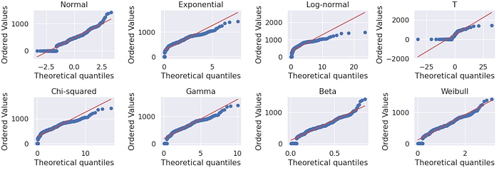
The GarageArea has a non-normal distribution; Most of the houses that have large garage areas have higher prices but there are some exceptions. Some houses have no garages but their prices are slightly high, this could be because of other factors.

YearBuilt: Original construction date
It looks like there was a significant change in the number of houses built between 1944 and 1947, this could be attributed to the 2nd World War. Additionally, there was a dip in construction between 2007 and 2010 which coincided with the 2007–2009 US financial crisis. There is also an interesting pattern between ~ 1980 and 1998 not sure what that is.

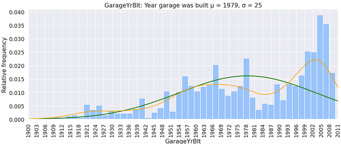
GarageYrBlt: Year the garage was built
The year the garage was built has a similar trend to the year the house was built. Most likely the houses and garages were built around the same year.

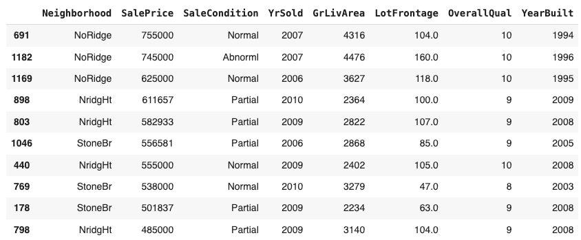
The two outliers with a quality of 10 are from the NoRidge neighbourhood. Later on, we will see if removing them yields any significant accuracy gain.
Garage Year Built and House Year Built
Most of the garages built the same year as the house are attached to the house followed by the ones detached from the house.

Most of the garages built after the house was built are detached from the house followed by the ones attached to the house.

There is a small percentage of detached and builtin garages that were built before the house was built.

YearSold
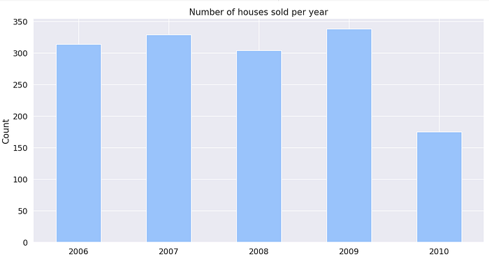
The column has no null values and most houses were sold in 2009 which is not significantly higher compared to the 2 years prior. Although there was a significant drop in sales in 2010; this could mean we do not have enough data to put it into context.
Neighbourhood: Physical locations within Ames city limits
NoRidge has the most expensive houses and the sale prices are more like outliers. Maybe removing the points might help improve model accuracy.


It looks like some sale price distributions by neighbourhood are normal e.g. Mitchel and North Ames —Briardale seems to have a bimodal distribution.


Modelling and Evaluation
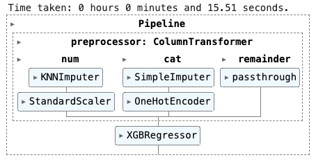
Next, we are going to impute the null for the categorical columns using a most frequent strategy. For the numerical values we are going to use a K-Nearest neighbour imputer to fill in the nulls — we are going to use an arbitrary K value of 2. Additionally, we are going to standardize the numerical features using a StandardScaler. Additionally, for the categorical columns, we are going to one-hot-encode the values which will transform them into numerical values.
When using XGBoost the RMSE was pretty high ~24769.66 and we have not done any tuning, we will do that in the next step but first, we need to get an idea of which columns are important. After normalizing the Sale Price the RMSE was reduced to 0.035, which is a great improvement; this is just on the training data and we’ll need to submit the results on test data to know what kind of accuracy we’ll get. We will also look at other models and how they perform.

Hyperparameter Optimization
For tuning we are going to be using random search CV while trying to reduce the Root Mean Squared Error. The features selected below are from a baseline XGBoost

Conclusion
CatBoost performed best during training with a baseline RMSE score of 0.13 but tuning it gave lower results 0.136 which was not significantly lower. The worst performing models in training were the linear regression models with an RMSE score of 0.183 and ridge regression also performed worse after tuning with an initial RMSE score of 0.184 and a tuned RMSE score of 0.192. When the results were tested in production (uploaded to Kaggle), CatBoost performed best while with an RMSE score of 0.1431 KNN was the worst performer with an RMSE score of 0.1656.

After shuffling the data we got improvements in the models, just changing this had the impact of reducing the highest RMSE score from 0.192 to 0.151. Cat boost RMSE increased slightly. It looks like even the simpler models can perform well in training but not in production — maybe there is some form of overfitting.

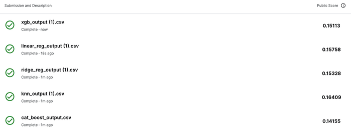
After dropping GarageArea, 1stFlrSF, GarageYrBlt and TotRmsAbvGrd columns the training accuracy dropped but the production results improved showing we made a step in the right direction and the model is generalising a bit better.
I’ll leave you with a challenge, extract the models and deploy them to your favourite server.
Thank you for reading, don’t forget to leave some claps; thank you for your support.
You can find the notebook here: https://github.com/Wamae/HousingSalesPrediction/blob/main/house_sale_price_prediction.ipynb
References:
- https://www.kaggle.com/code/yaginun/crisp-dm-process-on-the-airbnb-dataset
- https://www.kaggle.com/code/sandhyakrishnan02/normal-distribution-skewness-and-kurtosis
- https://saturncloud.io/blog/how-to-transform-a-scipy-sparse-matrix-to-a-numpy-matrix/
- https://www.analyticsvidhya.com/blog/2021/05/shape-of-data-skewness-and-kurtosis/
- https://sscc.wisc.edu/sscc/pubs/RegDiag-R/index.html
- https://datatab.net/tutorial/test-of-normality#:~:text=To%20test%20your%20data%20analytically,your%20data%20are%20normally%20distributed.
- https://www.youtube.com/watch?v=AVketBmpUTE
